Wednesday, 9 December 2015
Tuesday, 8 December 2015
Tuesday, 1 December 2015
Final Movie Review: "The Croods"
(fanart)
“The Croods” (2013) is an animated comedy
directed by Chris Sanders and Kirk DeMicco. It is very much filed with a
slapstick humour and takes the viewer through an extraordinary journey. In his
movie review Nell Minow states: “Despite
a few too many mother-in-law jokes, "The Croods" nicely makes it
clear that even before they had fire, families understood how important it was
to cherish and protect each other.” (Minow, 2013) Perhaps this is the main
strength of “The Croods”, apart from
the stunning visuals – the way they wrapped an important message in a comical
way.
The comedy comes from the extraordinary situations that the
cavemen family is getting into. Even though their life motto is “Never not be
afraid” somehow the Croods manage to fall, stumble, being attacked and crushed
by almost anything in their world. This slapstick approach works excellently in
the form of animation since it doesn’t require any actual stunts and the
squishiness of the characters makes them increasingly funny as the film
progresses. The definition of slapstick comedy in encyclopedia Britannica is as
follows: “a type of physical comedy
characterized by broad humour, absurd situations, and vigorous, usually violent
action.” (Encyclopedia Britannica, 2015) The good thing about making a
slapstick animated comedy though is that when real actors fall, trip or are
violent it can become very cringy, very quick. It also leaves a bit of a
negative vibe after watching. An animation however can balance things out and
keep things light and humorous.
If I had to discuss a particular scene from the film my
favourite is probably when the the Croods go for their breakfast after spending
3 days in their cave. The now simple morning meal, is exaggerated to an extreme
when it turns into an American football match where even the vicious little
Crood baby plays a major role to win over an egg. What makes it exceptionally
successful are the mechanisms with which their universe operates. People can
jump really high, everyone is really quick and very strong. There are boulders
being thrown and giant bird creatures running after the attackers. The comedy
is not purely visual as well a lot of it relies on the sounds. Every time
someone is being squashed they produce the funniest sounds.
“The Croods” did
not make me laugh out loud particularly but I was tremendously entertained by
the world it presented. What made it funny were the characters, their design
and behaviour the way they reacted to different situations and to each other. I
think the main success of the film, personally, were the visuals, the saturated
and rich universe in which you just want to walk around with a sketchbook in
hand.
Overall “The Croods”
definitely won me over and it brought back a very sentimental feeling of when I
was watching Tom and Jerry running around and slipping on banana peels.
Bibliography:
Minow, N. (2013). The Croods Movie Review & Film Summary
(2013) | Roger Ebert. [online] Rogerebert.com. Available at:
http://www.rogerebert.com/reviews/the-croods-2013 [Accessed 27 Nov. 2015].
Encyclopedia Britannica, (2015). slapstick | comedy.
[online] Available at: http://www.britannica.com/art/slapstick-comedy [Accessed
27 Nov. 2015].
Thursday, 26 November 2015
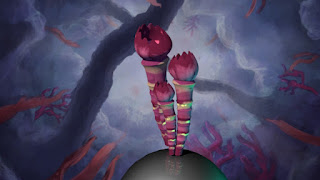
Narrative: Coral Type #2
This one is elongated, the texture was drawn with a mouse so it doesn't look a %100 good, but will improve on it at home.
Lens Blur effect
Tried the method Alan presented to us today, looks very cool :)
No Blur:
After the blur was applied:
Character Design Workshop: Final session
We had some fun designing specific characters and their environments this week. First one I did was Jetpack Jones, along with some symbol designs for Galactic Aviation Force and some plasma gun designs.
Second one was Tessa Storm and a few tool designs.
Final one was an environment, in my case it was Bio Lab 77, which is supposed to be filled with carnivorous plants and completely taken over by them. The plant design is in the bottom right corner and at the top are the poor scientists taken over by the spores, walking around, zombified :)
Tuesday, 24 November 2015
Character Design Workshop: Environment experiment
A quick concept of a forest with a more romantic lighting and a softer feel. Don't think it particularly works with the overall theme of my project, but it was worth the try. :)
Character design workshop: Dragon concept
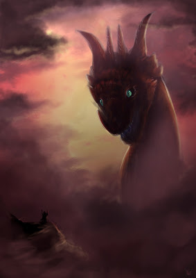
I don't think this design is going to make it for the final character but I am planning on making "filler" cards of all the concepts that are left, creating a bigger variety of monsters for different card designs.
Character design workshop: Dragon redesigns
Finalizing some of the versions of the dragons I will be painting.
Since ferrets have a very fluid body, I did some pose studies that will help me with the final look of one of the dragons. Already picked one. Rhinos were used for the posing of the predator and a swan for the arcane design.
Character design workshop: weekly update
We had to play around with designing a card game interface (which was helpful for my personal project too). The word I had to draw inspiration from was "ninja".
Character design workshop: Designing the back of the cards
This is the initial design of the back of the cards. The front is going to be consistent with the frame.
After designing the three symbols for Mind, Body and Spirit I stuck them at this version of the cards back, finalizing the design. It also serves as a cheat sheet - the spiral (spirit) defeats the chalice (mind), the mind defeats the body and the body defeats the spirit, creating a full circle.
Character design project: Map
The map of the world is inspired by Gondwana and will be used as a playmat for the game and the back of the card game I am designing.
Character design project: Symbol design process
The designing process is explained on the images. The symbols are important as well since they are used for the back of the cards.
Thursday, 19 November 2015
Tuesday, 17 November 2015
"Jack the Giant Slayer" movie review (adaptation)
(Fig. 1 –original poster)
“Jack the Giant Slayer”
is a film directed by Bryan Singer in 2013. It adapts the story of “Jack and
the Beanstalk” which is a traditional English folklore tale. The film introduces
quite a few changes from the original tale, in a mostly unsuccessful way,
however it does have its perks. As Richard Roeper says: “"Jack the Giant Slayer" is filled with neat touches, from
the casting of Ewan McGregor as Elmont, a knight in shining armour who's
supposed to be the hero of the story and is indeed A hero, but not THE hero, to
an epilogue that's just flat-out cool.” (Roeper, 2013)
Perhaps the most annoying detail was the main character who,
as in many teen/children films believes his way out of any situation and his
positive attitude immediately translates into a successful outcome for any
challenge. He is implied to be a dreamer and disappoints his uncle by trading
the family horse for a few “magic” beans. However the moment the beanstalk
appears he turns into some sort of an action hero and quickly becomes the
saviour of the whole kingdom.
What this film does
is mostly expanding on the story, rather than omitting details. It lasts for around
2 hours and drags a bit. The overall feeling is overwhelmingly positive though.
Even if at times the film feels a bit generic. David Hughes says: “Where Jack The Giant Slayer really stands
head and shoulders above other recent fairy tale adaptations is in its sense of
adventure, which is closer in spirit to The Princess Bride and Shrek than the
try-hard Twilight wannabes.” (Hughes, 2009)
What the movie adds to the source material are a lot of
little details to make the narrative smoother for the big screen and some major
changes like adding a romantic touch in the face of a princess that falls in
love with Jack. Since the idea of the film is slaying giants too, it would have
been a very unfair fight if the humans didn’t have any advantages, being so
small and crushable by the deformed giants. The story includes a crown, forged
from the heart of a giant and whoever wears it controls the giants.
Visually the film is very CG dependant. It starts a bit
shaky but it soon turns very cinematically pleasing even though a lot of the
landscapes were not particularly memorable. The scenes have this fake quality
about them and make the viewer very aware of the matte paintings used.
In a sense “Jack the
Giant Slayer” is doing its job successfully. At the end of the day it was a
fairy-tale adaptation and perhaps the audience it was aiming for is slightly
younger viewers. The film was a box office success and has a lot of value to
it.
Bibliography:
Roeper, R. (2013). Jack the Giant Slayer Movie Review (2013)
| Roger Ebert. [online] Rogerebert.com. Available at:
http://www.rogerebert.com/reviews/jack-the-giant-slayer-2013 [Accessed 17 Nov.
2015].
Hughes, D. (2009). Jack The Giant Slayer. [online] Empire.
Available at: http://www.empireonline.com/movies/jack-giant-slayer/review/
[Accessed 17 Nov. 2015].
Illustration:
Fig. 1 - Upload.wikimedia.org, (2015). [online] Available
at:
https://upload.wikimedia.org/wikipedia/en/b/b4/Jack_the_Giant_Slayer_poster.jpg
[Accessed 17 Nov. 2015].
Thursday, 12 November 2015
Narrative: 2D Coral test
This was so fun to do, but it ate my whole evening, the animation was rushed but the actual potential of using 2D planes in our animation is there.
Character Design Workshop: weekly update
This week's exercises were really fun, designing creatures based on real life ones and environments.
Will paint most of them as soon as I have the time. My personal favourite is the plant dinosaur on the second picture. :)
Tuesday, 10 November 2015
Chracter Design Workshop: Card Layouts
Just some quick ideas, trying to visualize how will the actual cards look like. I will add the text on the finished cards and the symbol in one of the corners. :)
Subscribe to:
Comments (Atom)


