Friday, 28 November 2014

"The Shining" Movie Review

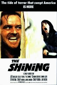
(Fig. 1 – Movie Poster)
“The Shining” created by Stanley Kubrick in 1980, based on the novel by Stephen King, is an amazing horror film that scares not with special effects, but incredible subtlety and a threat that is as real as everything in the film. Insanity created by isolation and surroundings that evoke the worst in the already mentally unstable Jack (Jack Nickolson).
The Guardian talks about the unique set and lighting used in the film: “The Shining is another chance to savour, first of all, those magnificent interior sets. Instead of the cramped darkness and panicky quick editing of the standard-issue scary movie, Kubrick gives us the eerie, colossal, brilliantly lit spaces of the Overlook Hotel (created in Elstree Studios, Hertfordshire), shot with amplitude and calm.” (Bradshaw, 2012)
The Empire Online talks about Kubrick’s quest for perfection and the challenges the actors needed to endure in order to achieve it: “In accordance with the Kubrick legend, the process of making the movie took meticulousness to staggering levels — Shelley Duvall was reputedly forced to do no less than 127 takes of one scene; Nicholson was force fed endless cheese sandwiches (which he loathes) to generate a sense of inner revulsion, and the recent invention of the Steadicam (by Garret Brown) fuelled Kubrick's obsessive quest for perfection. The result is gloriously precision-made.” (empireonline.com, 2014)

The movie is full of symbolism and symmetry, but in every scene with perfectly aligned objects and almost always portrayed using a 1 point perspective there is something slightly moved to one sight, as if to create more tension in a seamlessly perfectly symmetrical scene as shown on fig 2. where the carpet extends to the left or the “exit” sign hangs above the right.

( fig. 2 – movie still)
Roger Ebert Talks about the film: “The movie is not about ghosts but about madness and the energies it sets loose in an isolated situation primed to magnify them. Jack is an alcoholic and child abuser who has reportedly not had a drink for five months but is anything but a "recovering alcoholic." When he imagines he drinks with the imaginary bartender, he is as drunk as if he were really drinking, and the imaginary booze triggers all his alcoholic demons, including an erotic vision that turns into a nightmare.” (Ebert, 2006) The movie is an incredible example of collaboration and adaptation. Stanley Kubrick not only created a film based on a novel, but made a masterpiece which was equally his and Stephen King’s.
(Fig. 3 – movie still)

Images:
Fig. 1 - MoviePosterDB.com, (2014). The Shining posters. [online] Available at: http://www.movieposterdb.com/movie/0081505/The-Shining.html [Accessed 28 Nov. 2014].
Fig. 2 - Collativelearning.com, (2014). THE SHINING (1979) analysis by Rob Ager. [online] Available at: http://www.collativelearning.com/the%20shining%20-%20chap%205.html [Accessed 28 Nov. 2014].
Fig. 3 - The Book Smugglers, (2013). Old School Wednesdays: The Shining by Stephen King. [online] Available at: http://thebooksmugglers.com/2013/09/old-school-wednesdays-the-shining-by-stephen-king.html [Accessed 28 Nov. 2014].

Bibliography:
Bradshaw, P. (2012). The Shining – review. [online] the Guardian. Available at: http://www.theguardian.com/film/2012/nov/01/the-shining-review [Accessed 28 Nov. 2014].
empireonline.com, (2014). Empireonline Reviews | Reviews | Empire. [online] Available at: http://www.empireonline.com/reviews/reviewcomplete.asp?FID=132700 [Accessed 28 Nov. 2014].

Ebert, R. (2006). The Shining Movie Review & Film Summary (1980) | Roger Ebert. [online] Rogerebert.com. Available at: http://www.rogerebert.com/reviews/great-movie-the-shining-1980 [Accessed 28 Nov. 2014].

Some initial sketches for Zoetrope #1

Obviously I didn't make that one, but #2 

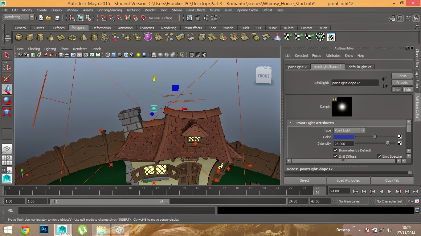
Exterior Lighting - Part 4 - Night


For this I know the right window has a bit of a "hot-spot" but the rendering took sooo long that I just had to ignore it, the rest of it looks good though :)

Exterior Lighting - Part 3 - Romantic

I learned my lesson with the rendering so, this time I only rendered in 10%  :) (apart from the last one obviously)


Exterior Lighting Part 2 - Sunset

The rendering time was incredibly long but I did it anyway (whilst cooking dinner). :)


Wednesday, 26 November 2014

Life Drawing


Another life drawing session, 4 5 minute poses and 2 for 30 minutes.

Monday, 24 November 2014

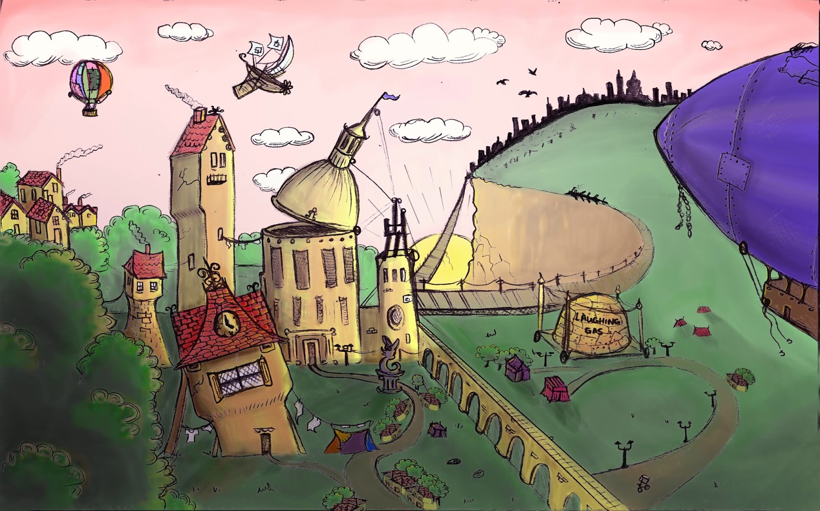
Post-OGR WIM concept

Changed my concept according to Phil's guidelines. Really like it now, feedback is welcome as always :)
Original sketch is in my sketchbook, transferred the line work on photoshop and added colours.

Charcoal Animation

Finally got my hands on our version of the charcoal exercise we did with Meg. :)

Exterior Lighting - Part 1 - Mid Day

Did this today with Simon, it was quite fun :)


Friday, 21 November 2014

WIM Clock Building Design

Got some very helpful advice from Simon today, regarding the texturing of the buildings in my metropolis. My first step though is to start modelling them in Maya first, so I started with the clock building, took around 30 minutes.

It's all rickety and out of proportion, hopefully it looks "hand-made" and rickety :)

Zoetrope idea #2

A quick gif of my second idea for a zoetrope :)

Thursday, 20 November 2014

"Repulsion" movie review


(fig. 1 – original poster)
 
 
Repulsion” (1965) is a psychological thriller that plays with the viewers’ sanity and conveys its ideas using an extraordinary sound and set design.

Peter Bradshaw states that: “It is one of Roman Polanski's most brilliant films: a deeply disturbing, horribly convincing psychological thriller that is also that rarest of things: a scary movie in which a woman is permitted to do the killing.” (Bradshaw, 2013) The movie starts slowly with a deep feeling of sympathy for the main character (maybe because of the camera close-ups of the face or because she is beautiful, immediately earning the attention of any viewer) and during the escalated insane killings one can only feel bad for the actress and somehow “approve” of her actions based on irrational fear of intimacy. Criterion.com talks about the main character – Carol (Catherine Deneuve): “She is soon haunted by specters real and imagined, and her insanity grows to a violent, hysterical pitch. Thanks to its disturbing detail and Polanski’s adeptness at turning claustrophobic space into an emotional minefield, Repulsion is a surreal, mind-bending odyssey into personal horror.” (The Criterion Collection, 2014)

The excellent usage of camera movements is explained by Elaine Macintyre: “While we never find out why Carol is the way she is, certainly by the end of the film we know what it feels like to be her. The camera acts as a conduit to her emotions: long slow shots that track her aimless progress down the street or follow her eyes as they alight on something horrible in the flat allow us to get right under her skin.” (Macintyre, 2014)


 (fig. 2 – movie still)
 
The viewer can see how the space which Carol inhibits is changing as she is slowly losing her mind and the grip of reality. Slowly but surely she cuts off her ties to the real world – not going to work, refusing to socialize and drowning deep in fear, pulling the curtains on her windows in an attempt to block any sunlight. The apartment changes, cracks appear and previously safe corridor turns into a forest of hands waiting for an assault.

One of the most disturbing scenes in the movie is when Carol puts on a lipstick, as if preparing for her imaginary assaults, part of which are quite frightening not because she screams, but because all sound is missing, making the viewer incredibly aware of what is happening and really uncomfortable. (fig. 3)


 (fig. 3 - movie still)


In conclusion, “Repulsion” is a great piece of cinematography, because it makes the viewer understand just what might be happening in the mind of a person who is consumed by fear and lost touch with reality, living only in their morbid hallucinations.

 
Images:

Fig. 1 - Cinefantastiqueonline.com, (2014). [online] Available at: http://cinefantastiqueonline.com/wp-content/uploads/repulsion.jpg [Accessed 20 Nov. 2014].

Fig. 2 - Macintyre, E. (2014). Cult Classic Film Review: Repulsion. [online] Elainemacintyre.net. Available at: http://www.elainemacintyre.net/film_reviews/repulsion.php [Accessed 20 Nov. 2014].

Fig. 3 - Adiana, A., Adiana, A. and profile, V. (2013). Ayunie Adiana: Mise-en-scène Film Programme: Repulsion (1965). [online] Ayunie-adiana.blogspot.co.uk. Available at: http://ayunie-adiana.blogspot.co.uk/2013/11/mise-en-scene-film-programme-repulsion.html [Accessed 20 Nov. 2014].

 
Bibliography:

Bradshaw, P. (2013). Repulsion – review. [online] the Guardian. Available at: http://www.theguardian.com/film/2013/jan/03/repulsion-review [Accessed 20 Nov. 2014].

The Criterion Collection, (2014). Repulsion. [online] Available at: http://www.criterion.com/films/404-repulsion [Accessed 20 Nov. 2014].

Macintyre, E. (2014). Cult Classic Film Review: Repulsion. [online] Elainemacintyre.net. Available at: http://www.elainemacintyre.net/film_reviews/repulsion.php [Accessed 20 Nov. 2014].

Wednesday, 19 November 2014

life drawing :)

Another lovely session. I still prefer the longer studies, but today we had 5 minutes poses, 30 seconds, 10 seconds and a long study at the end. :)


Monday, 17 November 2014

WIM OGR 2

Orthographs


Just the main things I want to model in maya for this project. Tried keeping them simple and understandable and hopefully with enough time will add details to them as I go along :)

Key assets production art

Tried imitating the feel of water-colours and keep it less straight and more fluid. I think these are the main objects I am going to include in the metropolis.

WIM final concept

After almost a complete mental breakdown trying to start this concept painting nothing really worked. I tried using maya, painting directly with colours (instead of the usual values first - then the colour layer) and I started over and over again but nothing was coming out properly. At the end I reached a point where I stopped caring and doodled in my sketchbook, scanned it in and was happy with the result.


 I used all my tricks to get the creative juices flowing, but it wasn't fun :(
Screenshot of it still being in the middle of nowhere but added some of the water-colour paper texture


Aaaaaand that's the final version.